Iantrek approached our agency seeking a brand refresh in light of their new products hitting the market. I partnered with a fellow designer on the project, with my primary focus on defining the visual direction and foundation of the new brand identity.
My responsibilities included conducting competitor analysis, exploring color palettes and typography systems, curating mood boards, and developing the final brand style guide. These efforts established a cohesive visual language that informed the creative direction of the new website and logo, which were executed by my teammate.
You can view the full brand style guide below.
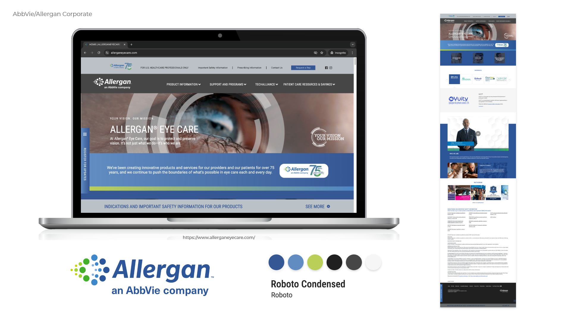
Competitor Analysis
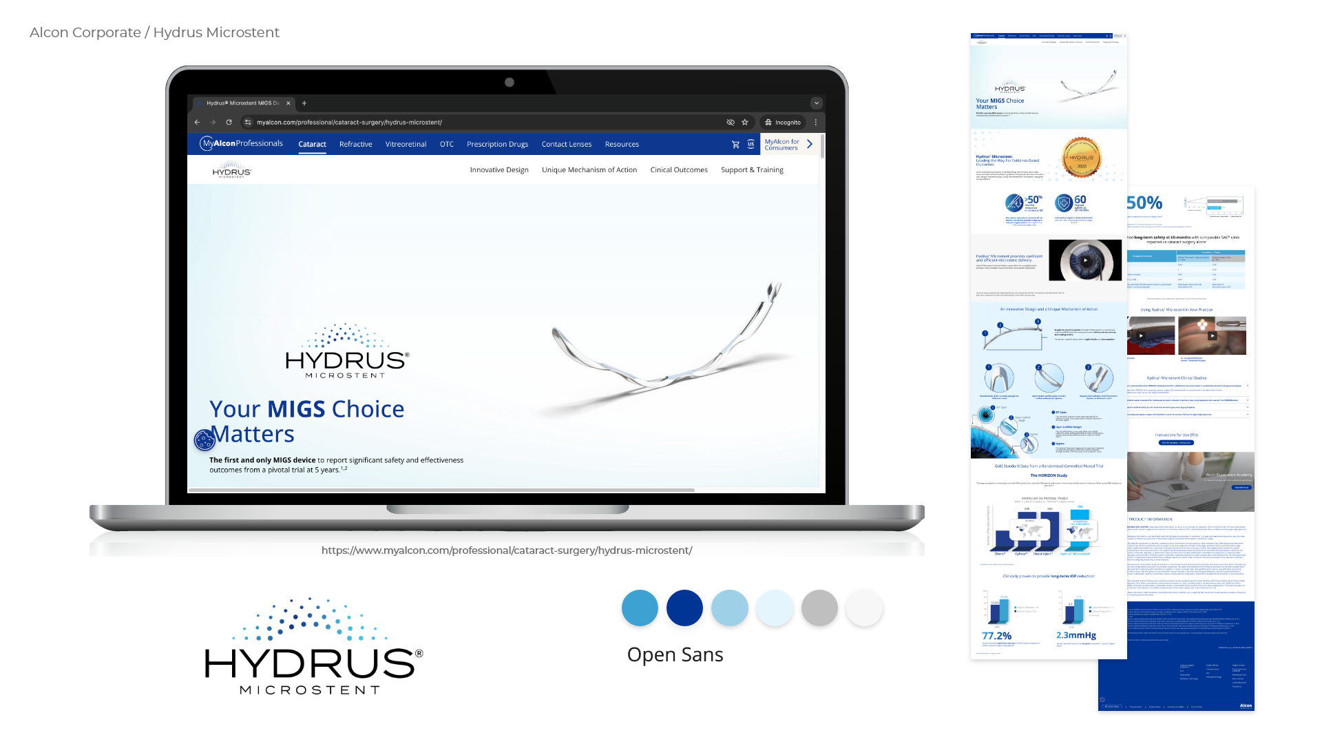
Using the competitor list provided in the client’s intake form, I conducted a visual audit of 22 brands. For each, I created templates featuring the hero section, logo, color palette, typefaces, and a full-page homepage capture to analyze patterns, differentiate brand positioning, and inform our creative direction.
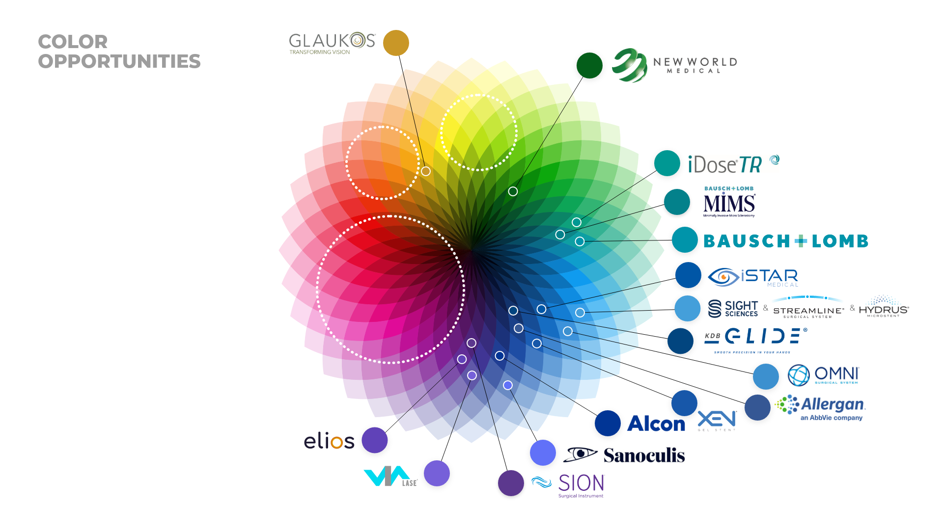
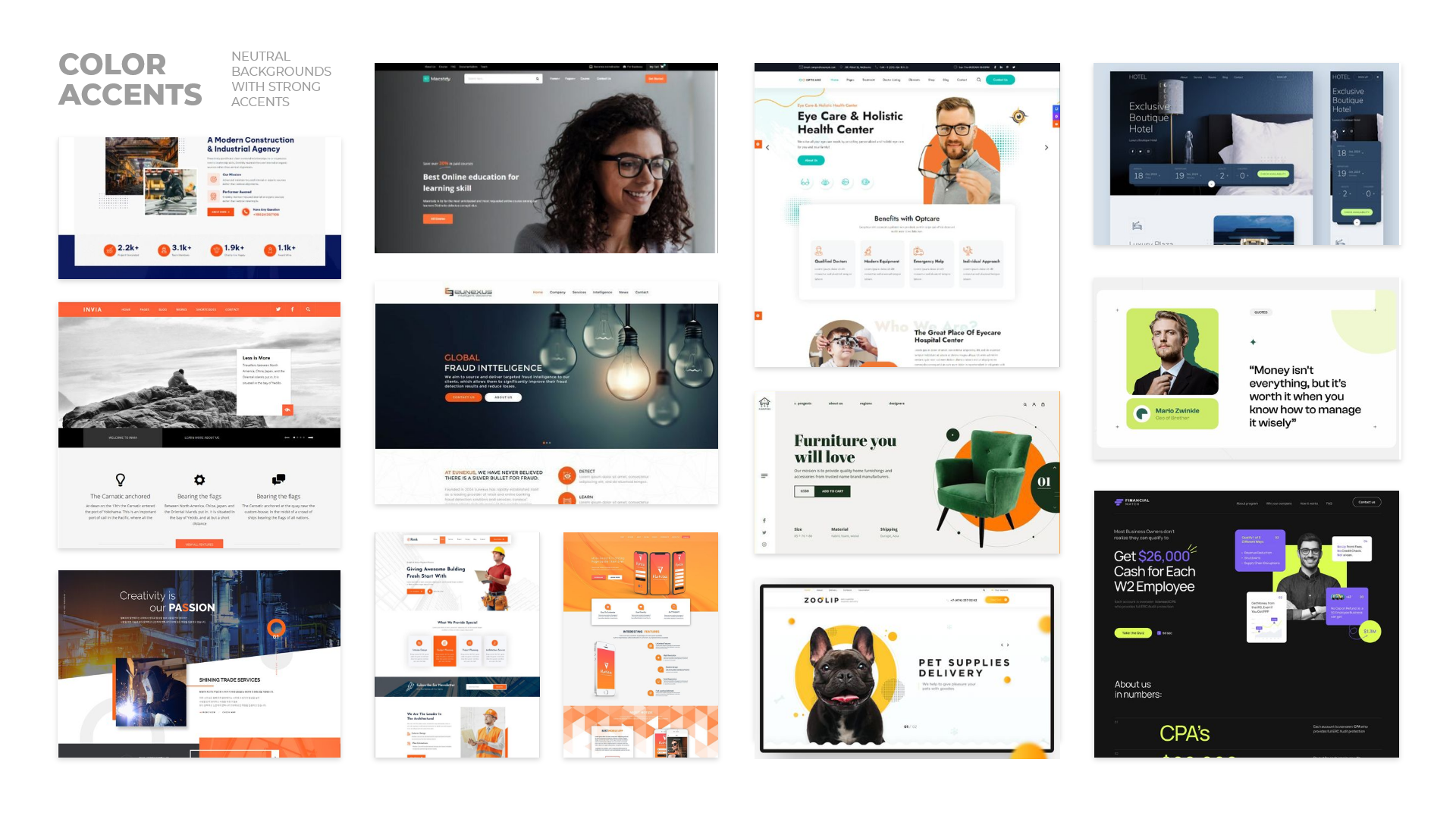
Color Analysis
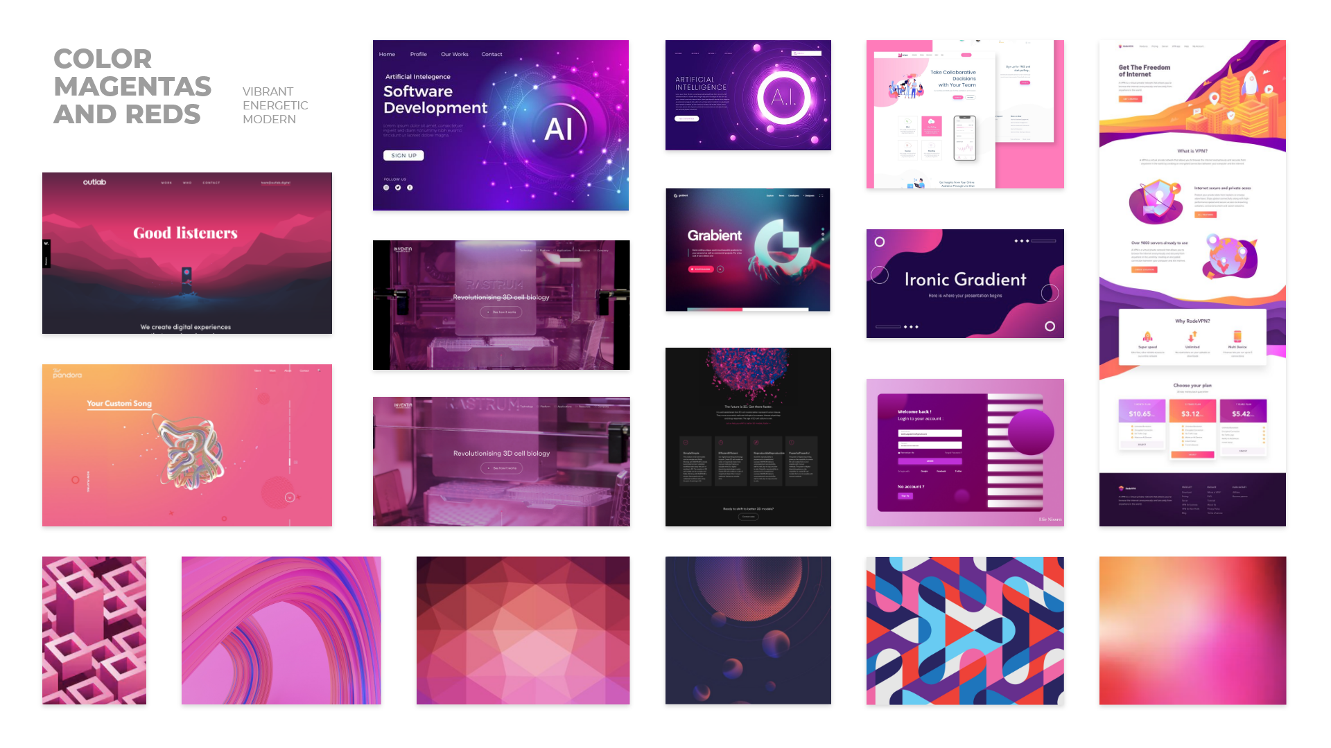
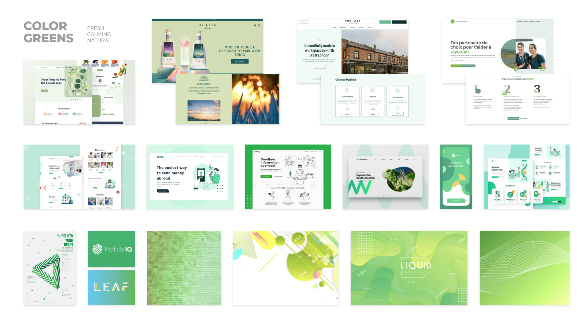
I mapped each competitor’s logo and primary color onto a color wheel, identifying gaps and opportunities in the visual landscape (highlighted by the dotted circles in the image below). Based on these insights, I developed mood boards for each color opportunity, providing the client with a foundation to explore brand directions.


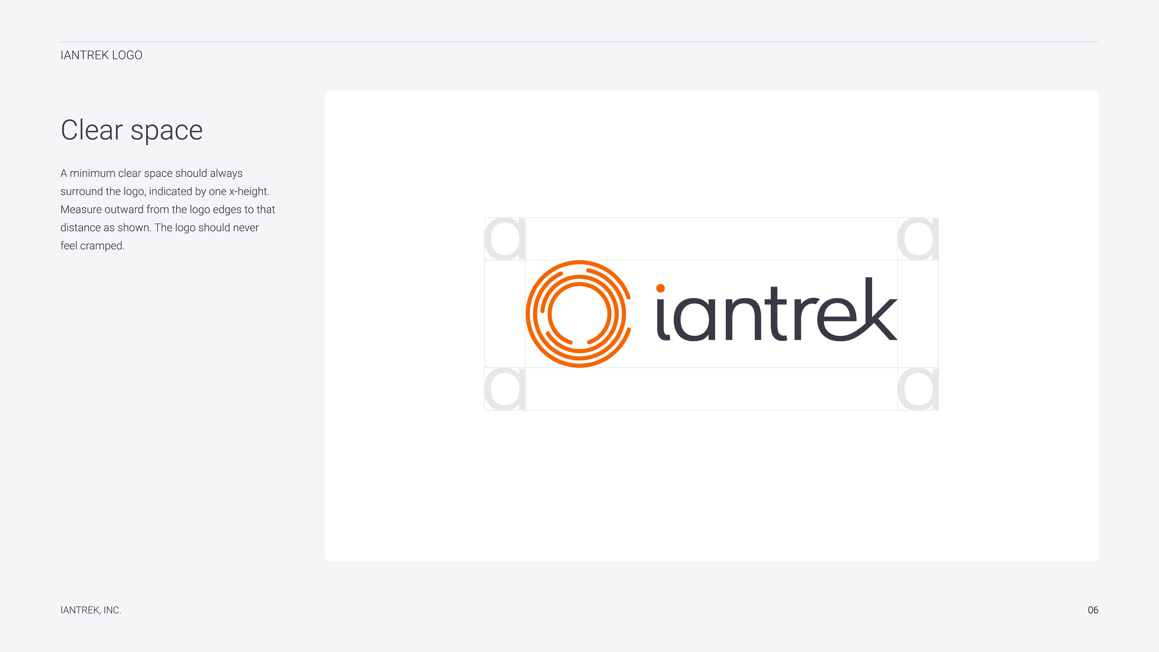
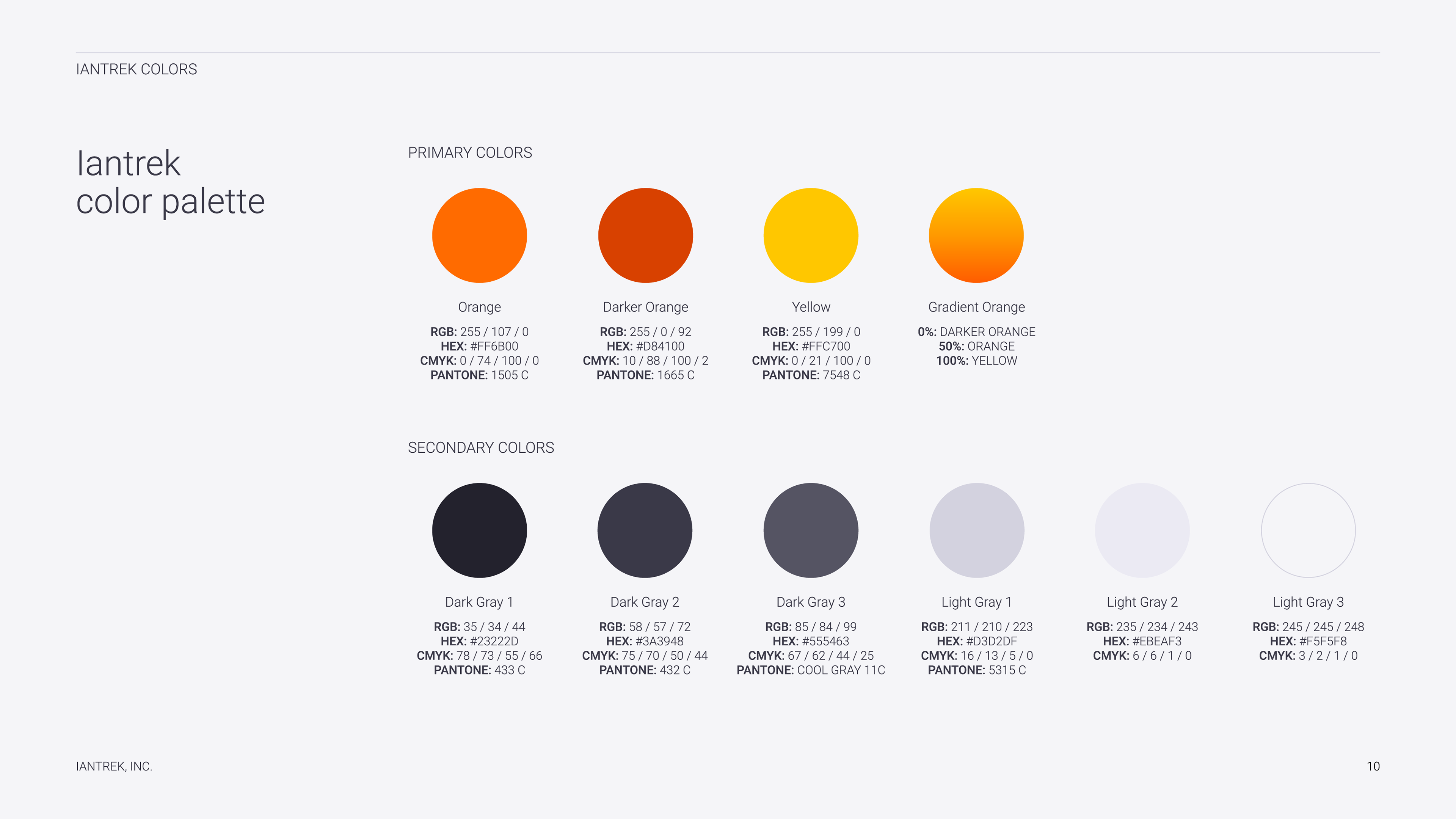
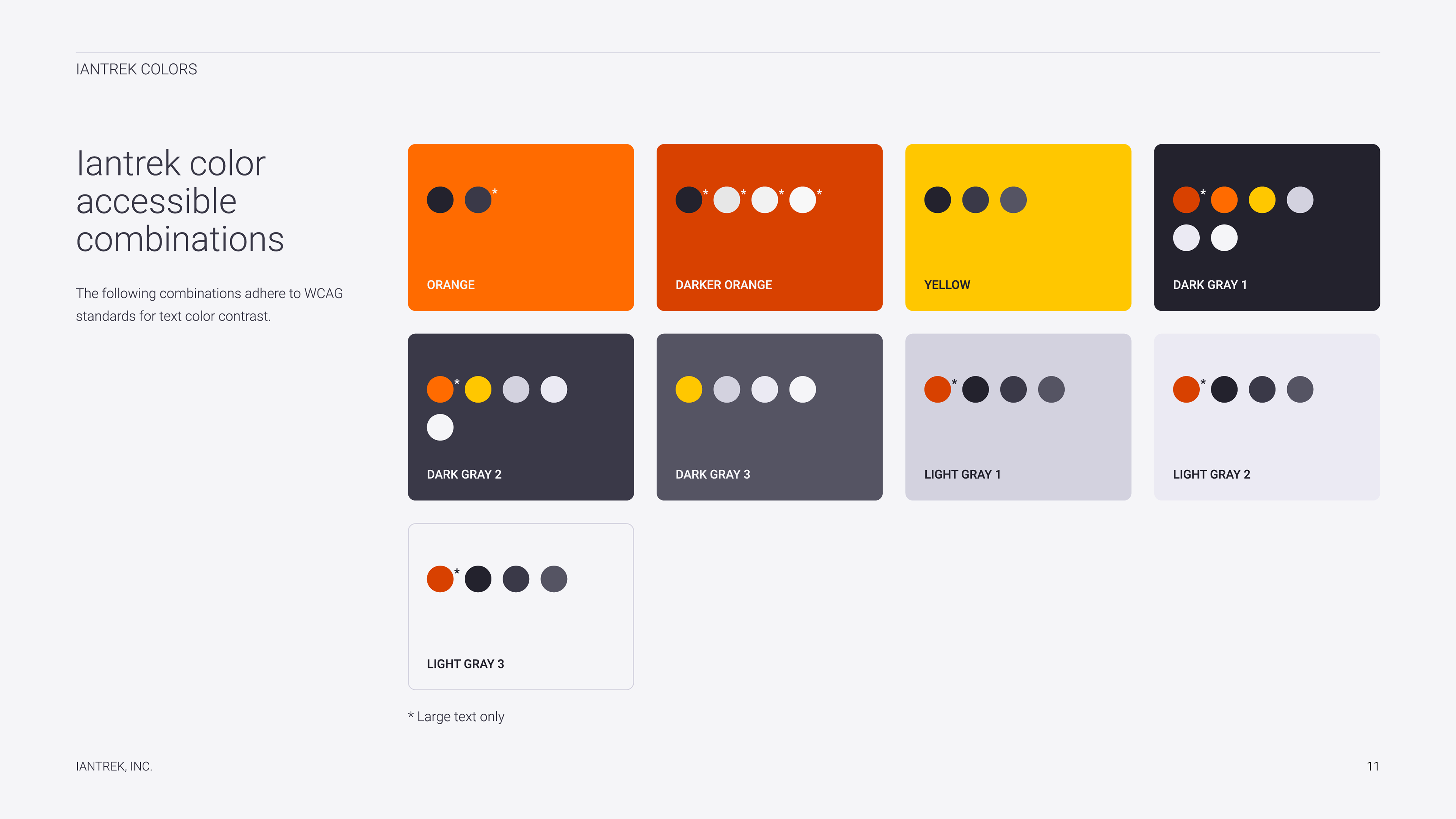
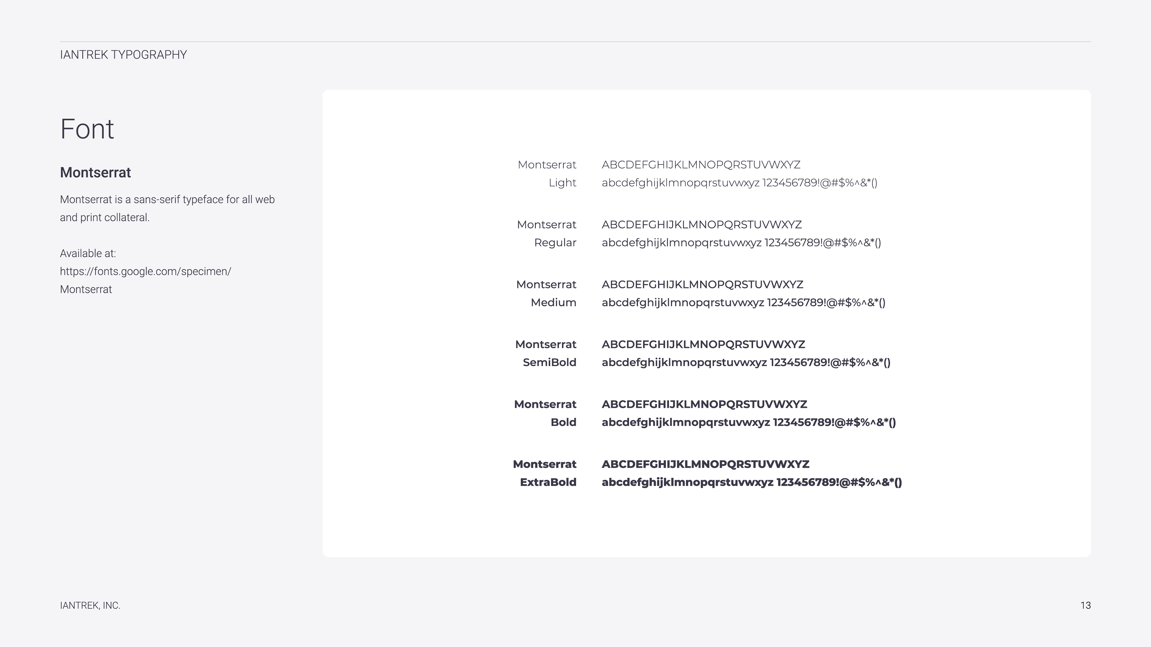
Style Guide
Once the direction was chosen and the logos finalized, I created a branded style guide for the client to use. Some of the key highlights were the logo usage guidelines, a color accessibility breakdown, and typography system.